

How to get insights in your (Sitecore) paas utilization using application insights and Power BI - Pt 1 - Overview
When running PaaS workloads in Azure, you often pay a certain fee for these services. In case of, for example, Azure App Services, these resources cannot be paused, which will net you some costs. When having larger, complexer sets of resources (for example, a Sitecore workload), costs might add up and when having multiple workloads, those costs will increase even harder. Lower environments, such as Dev, Test, Acceptance, Quality, or whatsoever, are often running 24/7, while they are not, or just a bit, utilized, however, it's not visible how much % of the time they are utilized and when this happens. In order to overcome this, I created a kusto query and a power bi report to acquire these insights. In a few blogposts I will give a small overview, show how to create the query, how to import the data into Power BI and how to create some neat heatmaps in the Power BI reports.
This is part 1 of 4 of this blogpost series
- part 1 (this blogpost) - introduction: in this blogpost I will cover the outcomes
- part 2 - how to create the kusto query
- part 3 - how to create the Power BI report
- part 4 - How to create heatmaps in Power BI
Based on these outcomes, certain decisions could be made: what environments might be deleted or be scaled down, and what kind of appointments should be made regarding reserved instances?
In the end, two reports will be available:
- a heatmap which gives insight what environment has what utilization per day, based on the activity on that environment (to make the decsion if certain environments should be removed)
- a heatmap which gives insight how many environments where actively being used on a certain hour of a day. (to make the decsion on reserved instances)
When talking about "activity", I use the following definition:
When more than 10 http requests are made to a web-server (in the case of Sitecore: a Content Delivery server) within an hour, than this complete environment can be marked as "in use" or "active".
The reports
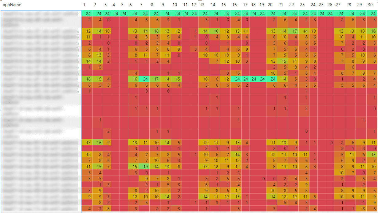
Heatmap with the utilization per workload/environment
This heatmap shows each day of the month(1-31) with in each row a separate environment. Every cell has a value 0-24, which means the amount of hours with activity on this environment. This gives insight on the utilization for each environment. In this snapshot (out of 150) - The first environment has a full utilization (24h per day), while there are some environments which could be used more.
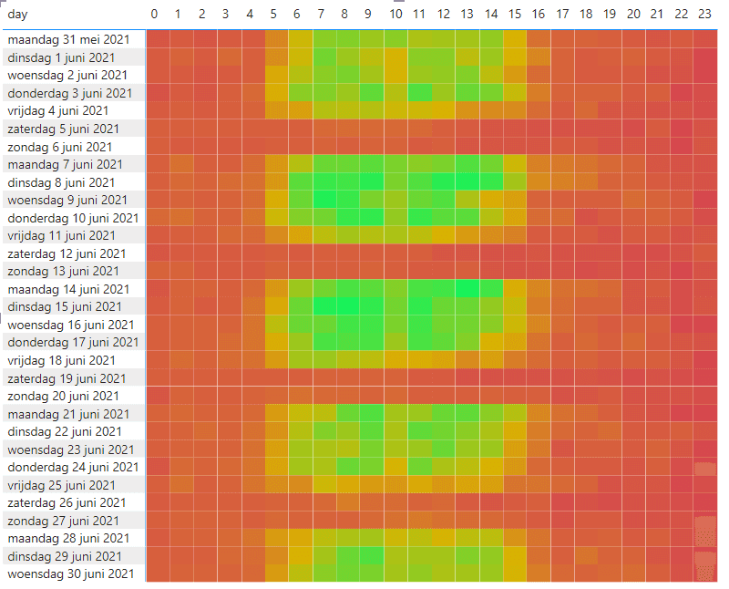
heatmap with the amount of systems running per hour per day
This heatmap gives insight in the amount of workloads which are being used at once and identifies peakload. Each column represents an hour of the day, each row represents a different date. It is (as expected) clearly visible that there is a peakload between 7 and 14h on weekdays and there is almost no activity before and after these hours, during weekends and on fridays.
Summary
Having insights in the usage of your environments help you in determing what environments can (temporarily) be deleted or scaled down to reduce costs, while it gives insight in determing how many environments are running at once and whether or not reserved capactity should be acquired or not. The next two blogposts will explain how to create these reports